how i made this website
may 12, 2024
my html knowledge started when i was 12 or so, in the now defunct official warrior cats forums. in 2021, i made a neocities account. this website had like two other iterations, both of which were kind of shitty before this one - only bookmarks and an about page.
this time i was resolute to not make it shitty.
i had some basic principles in mind:
- keep it simple, so that i can add content with ease
- make it look decent on mobile, zoomed in, and with other window sizes for accessibility
- keep it high contrast
- make it pleasing to the eye. at least to my own
- code it myself and not use templates, at least for the main structure + pages
so, after refreshing my mind with some basic html tutorials to reference tags, it was time to get to work!
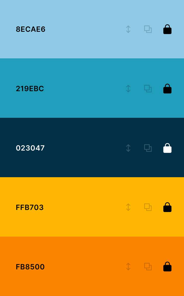
i got a color scheme from coolors.co (not sponsored) that i enjoyed - gold is one of my favorite colors, so i wanted to use it for accents.

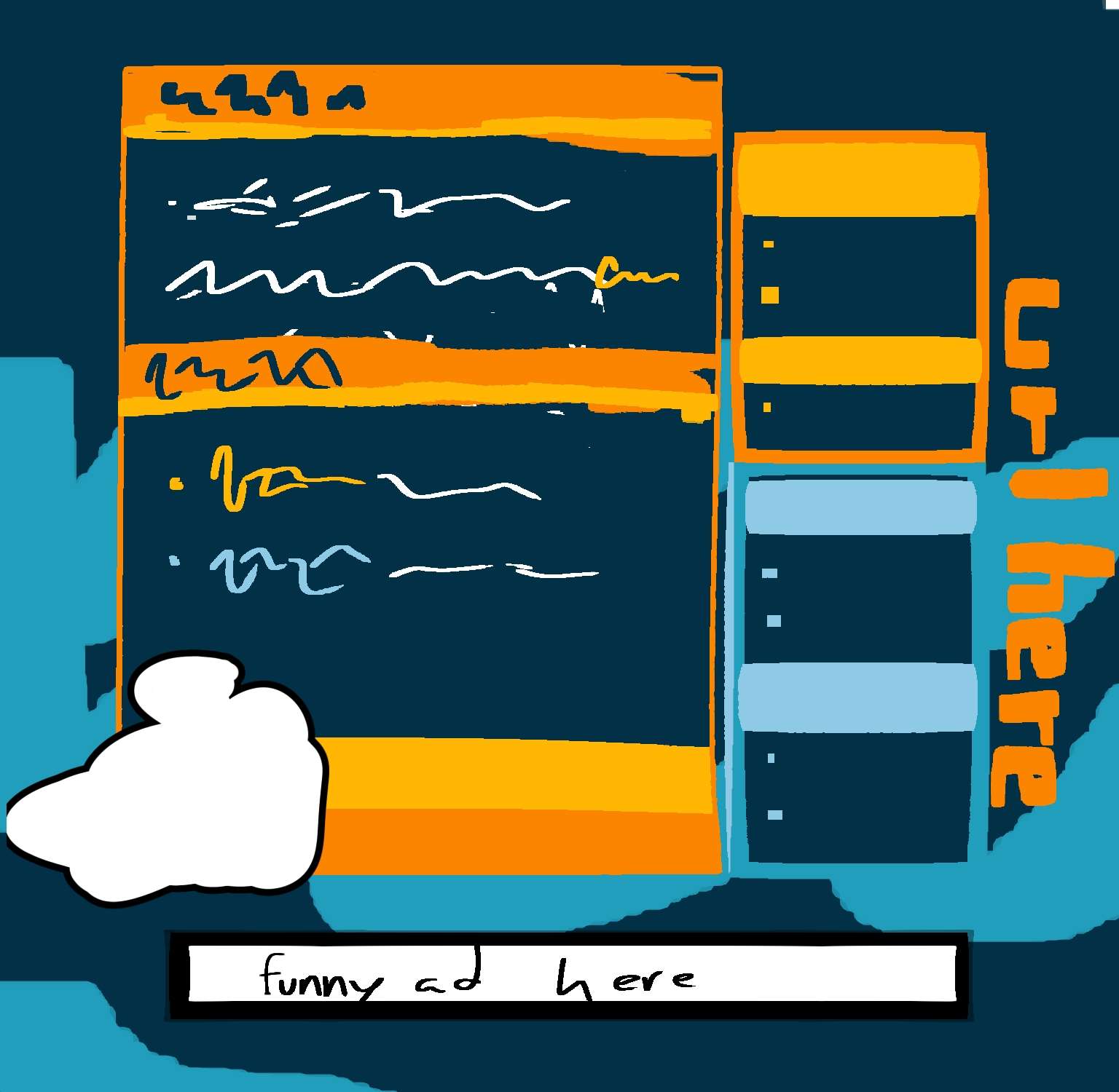
i thought, hey, this is good enough. so off i went to thumbnail my idea.

many things in it were scrapped to keep in line with the principles i had in mind, but still - this was a great idea! i'd reference it a lot later on.
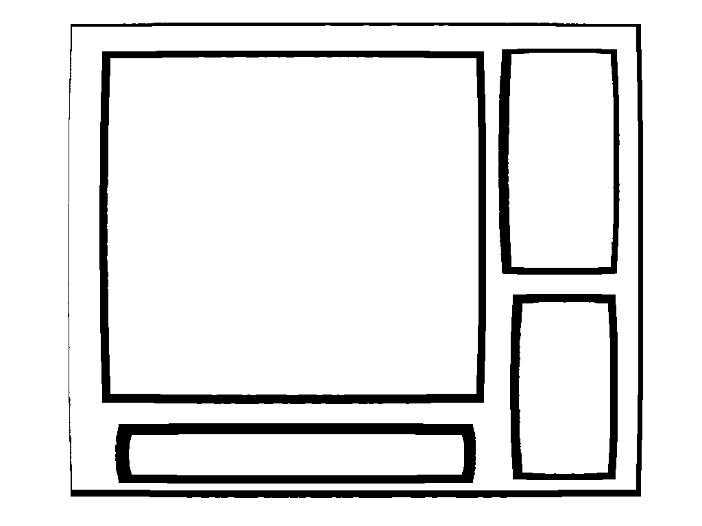
now that i knew what i wanted it to look like, it was time to build a skeleton to make sure things were correct before adding flair. i don't have a screenshot of it in that step, but i can make a shitty sketch.

websites are boxes inside boxes inside boxes, it's just that in the end some of them end up being transparent. to size things properly, i only messed with width, using percentages as measurement unit (for mobile and zooming-in friendliness) and setting the margins until it looked right.
i looked at other sites a lot to see how they handled their content. i opted not to use iframes for the main feature, but i'd seen the use of them for keeping a consistent sidebar everywhere without having to manually edit it in every page, and found it smart. so i did that! and in the process had to fuse the sidebar boxes.
(speaking of giving up aspects, i had to scrap the url on the vertical because whenever i checked with zooming in or different window sizes, it looked terrible. sucks, but i prefer function over form...)
also, a lot of people recommend using flexbox or grid layouts, because supposedly it's easier to position things. i've tried in the past and it wasn't at all for my brain. and that's okay! it's a personal website! i wanted to have fun with it, and that means not following standards all the time. it works the way i wanted and that was enough.
anyways! with this flexible layout in hands it was time to make it look good. i couldn't figure out a BIG background for it, so i thought to go with a tiled bg for extra "this is a personal website" flair.
(at one point, while looking for tiled backgrounds, i stumbled upon this really good archive of them on codepen, linked on a toyhou.se post, and because i didn't want to lose them ever, i... spent two hours saving all of them manually because i didn't want to risk siccing DownThemAll on the page and it not working.)
i looked for fonts on dafont (not sponsored), edited assets on photopea and dither me this, and drew them on aseprite (did you know it's free if you compile it yourself). for "fancy" boxes, i looked at foollovers, grabbed one that did what i wanted to in a different pattern, and mangled it almost beyond recognition. decorating a layout is easy when you know what you want - having too many options makes it harder sometimes!
summary
aka what i hope you'll take away from this...
- know what you'll do first. thumbnail your website! have some sort of idea of the bare minimum you want!
- make it intuitive for yourself. you don't have to follow guidelines. (you don't have to follow what everyone does even in indie spaces either... yes, this is a bit hypocritical, to hear this in here.) make something you know how to play around in.
- don't do it alone. by that i mean, look around the web! get inspired by other websites! grab small code snippets and resources (from places where you're meant to do that, of course), see people's solutions for issues you may have.
that's about it. let's build indie websites. together

